My favourite branding project I've ever worked on is Quatro. Me and my teammate Kirk Caspe were tasked with the rebranding and website development for an old beverage brand that was out of business. We chose Quatro.
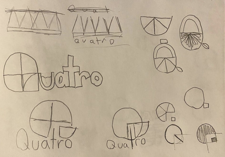
As graphic and motion designer for the project, I thought Quatro had the best potential for making something new and exciting. I started by doing some research about the original company and their branding, and then began sketching ideas.

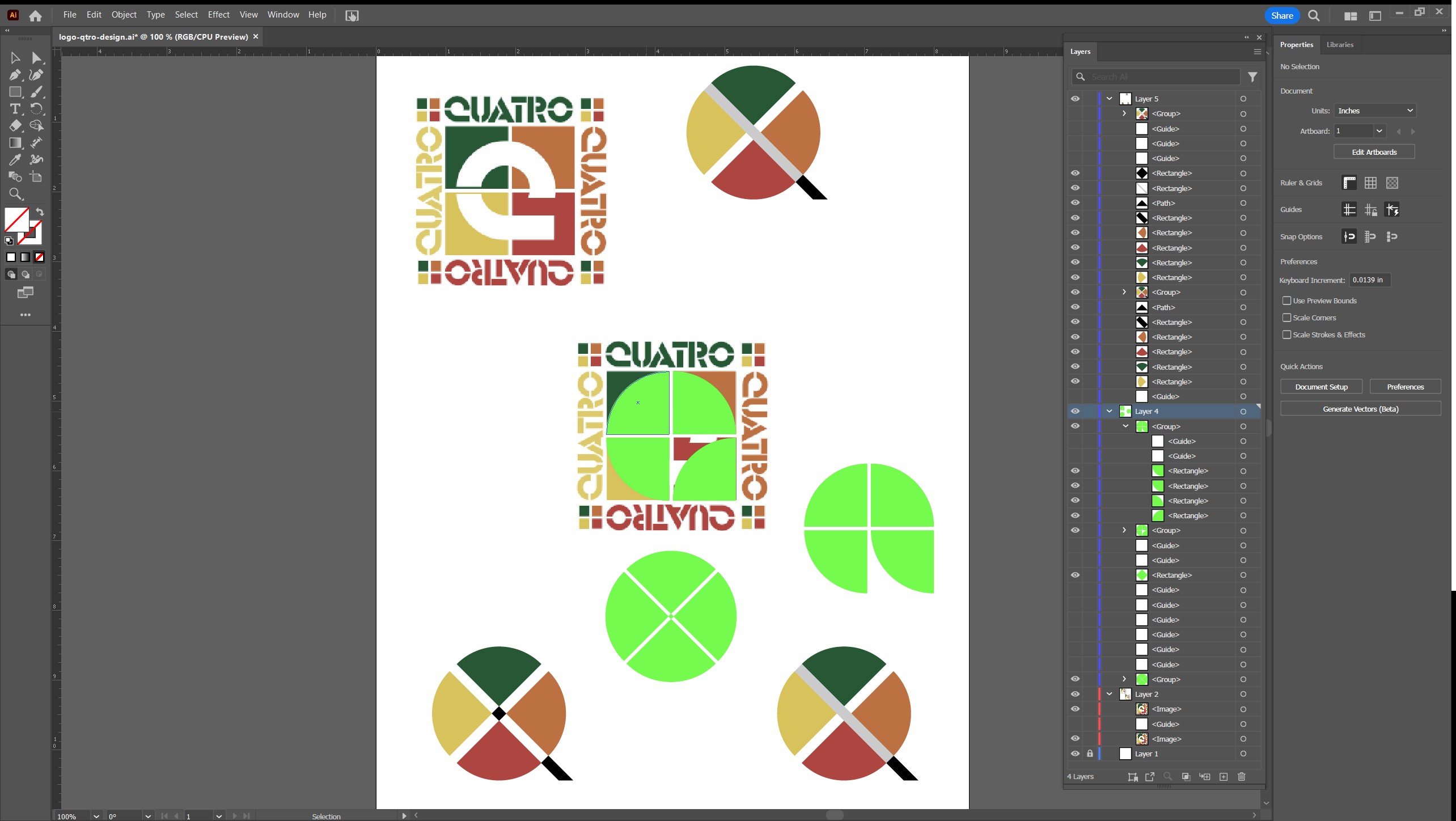
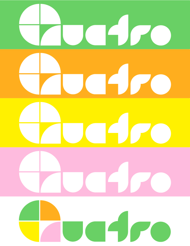
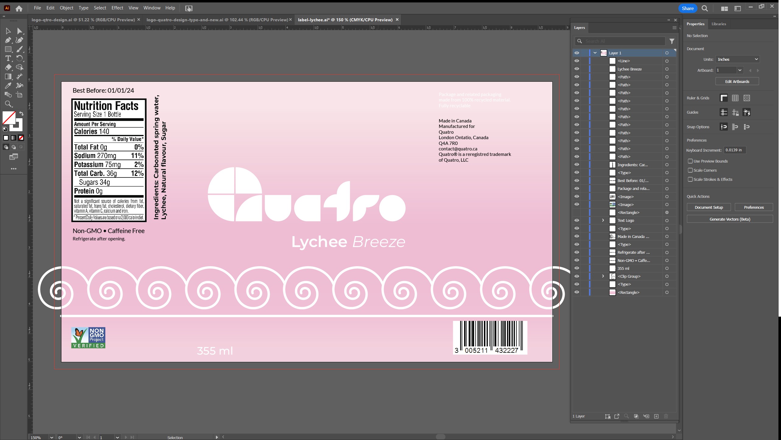
When I finally came to a couple concepts I was happy with, I brought the project into Adobe Illustrator. I started with the old logo, set up some rulers, and began working with the original lines and colours. As a logo with simple shapes that used negative space in a square made of 4 colour-blocks, I thought I could invert it and rejuvinate the appearance. I built colour-blocks within the Q shape negative space and removed the outside squares.
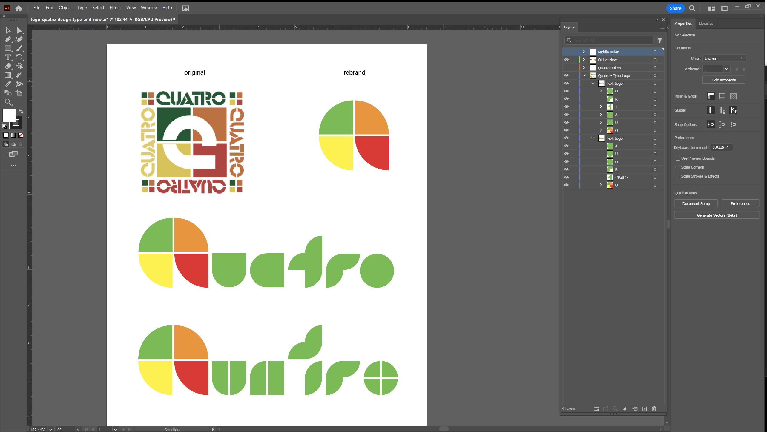
After some experimenting and adjustment, I landed on a simple clean logo that felt very effective. It used the same 4 colour-block scheme as the original, but the inversion made it a logo that can be used as an icon, and I also designed a custom typographic version of the logo with the lettering following the same clean cut block design as the icon.
By this point I had decided, since Quatro was meant to be a fruity beverage I wanted to encapsulate the freshness and excitement of summer. The original colour scheme was dark and dull, and it was in dire need of a refresh. Since our target audience was youth I wanted the colours to pop and the final product to be eye catching. I brightened the orange, green, and yellow, and I swapped the red out for a bright pink. With a bit more adjustment and tweaking the logo was ready for the next steps of branding.
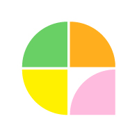
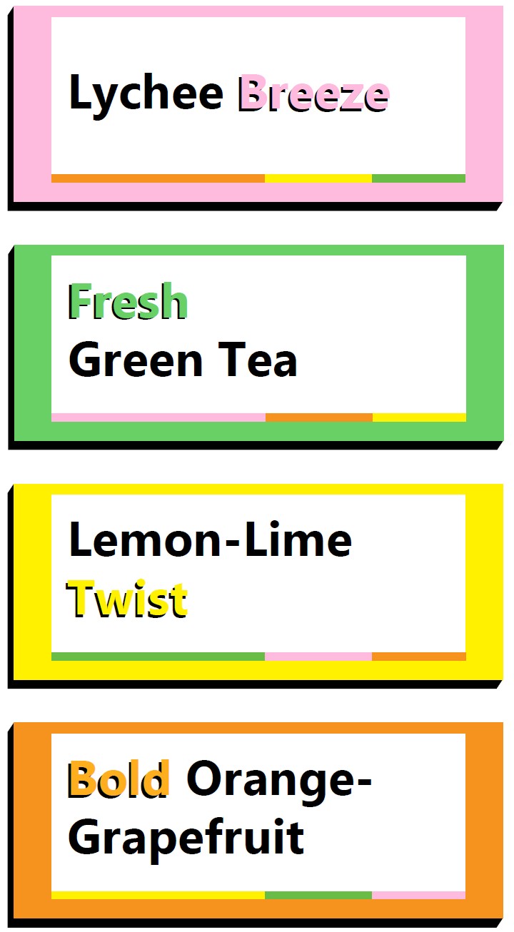
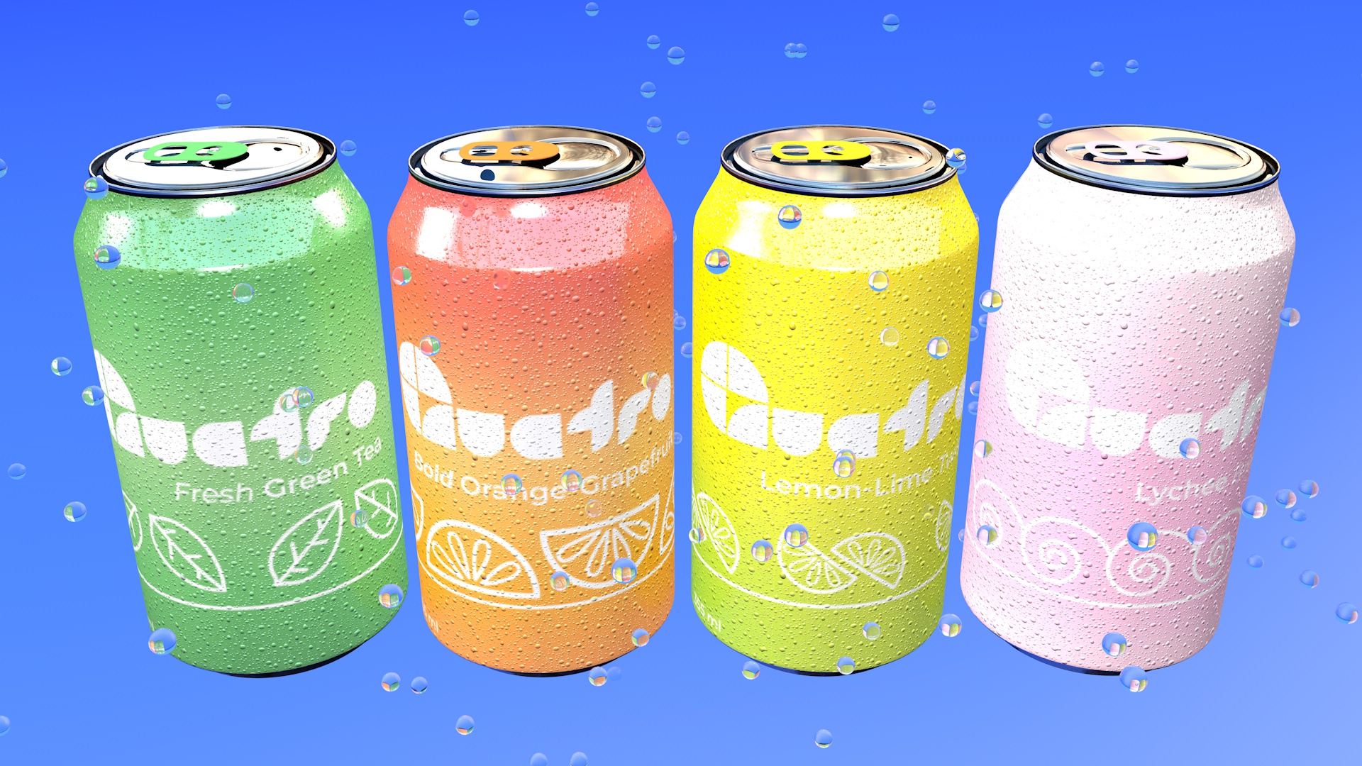
The colours were the inspiration for the flavours I chose (see flavour cards and labels above), and became a key part of the brand identity. The flavours I came up with and their respective colours were Lychee Breeze (Blossom Pink), Fresh Green Tea (Leaf Green), Lemon-Lime Twist (Citric Yellow), and Bold Orange-Grapefruit (Tangerine Orange). Overall this project really grew my love for brand design, and since it has become one of my favourite kinds of projects to do. If you're ready for a rebrand, don't be shy, contact me below and let's get started!
Like what you see? Want to see more? Let's work together! Use the contact form to reach out, and I will get back to you ASAP!