I've always been fascinated with packaging design. It really can sway your entire opinion on a product, and that's exactly what made this so exciting for me.
After finishing the branding for Quatro with the new and improved logo, I needed to make labels for the can mockups that I had yet to make. I knew it had to be bright, fun, and fresh to go with the energetic and exciting flavours for our young target audience. I also began brainstorming ideas to make the cans stand out.
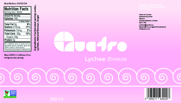
Using the new flavours I made earlier in the project (see Quatro Part 1), I moved into Illustrator. I used a template for the shape of the label to make sure it would wrap around the can perfectly. This also gave me a better idea of where the face of the can would be. Next I got the base colours down and started creating custom designs for each flavour.
I made a custom graphic to go around the can based on the play on words for each flavour name. I added the logo, nutrition facts, barcode, and other key information, and then started messing around with the can colours.
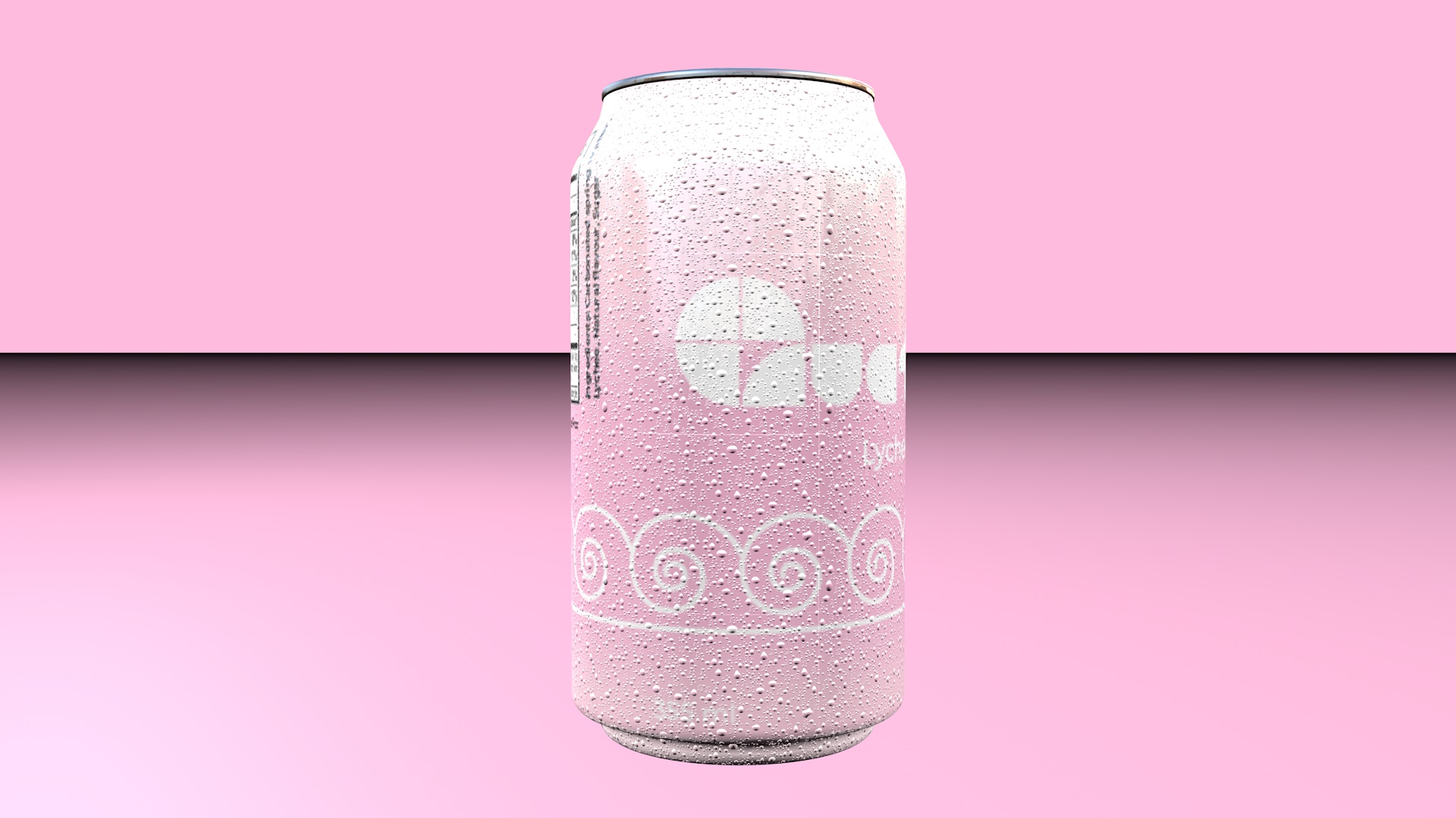
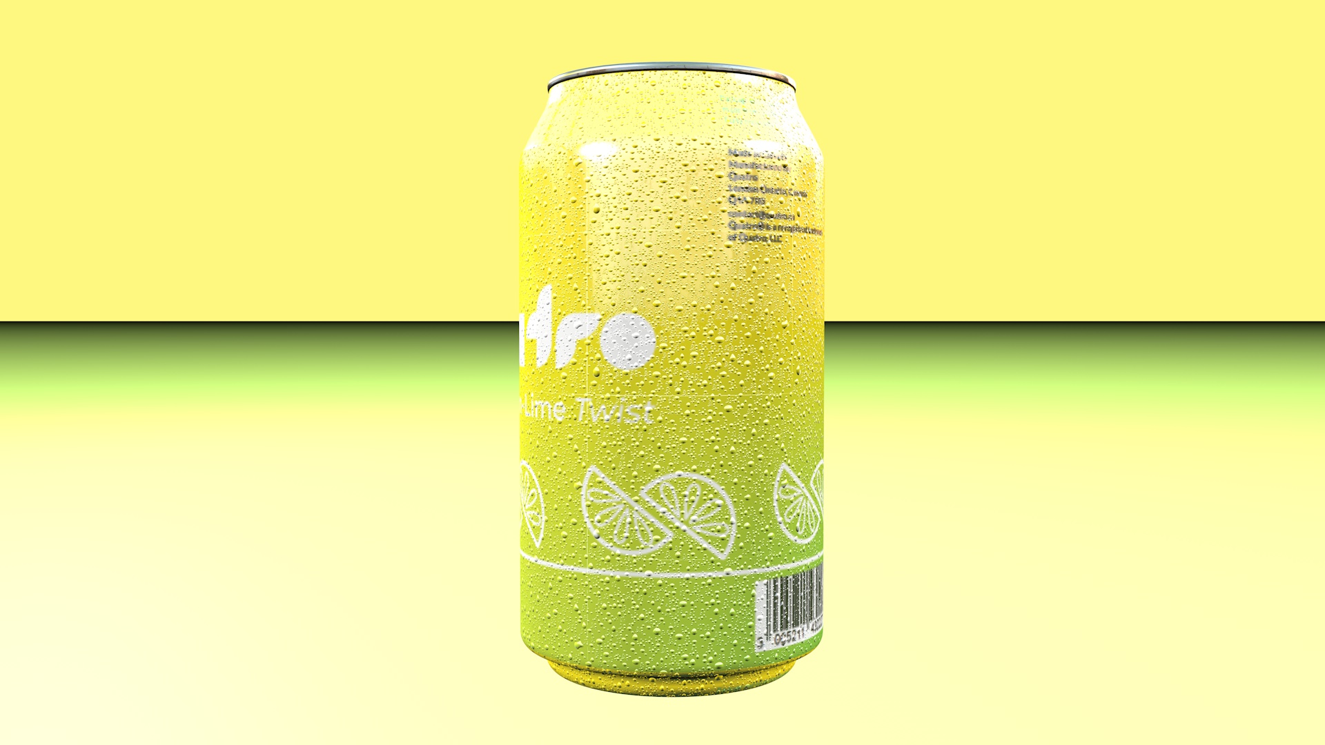
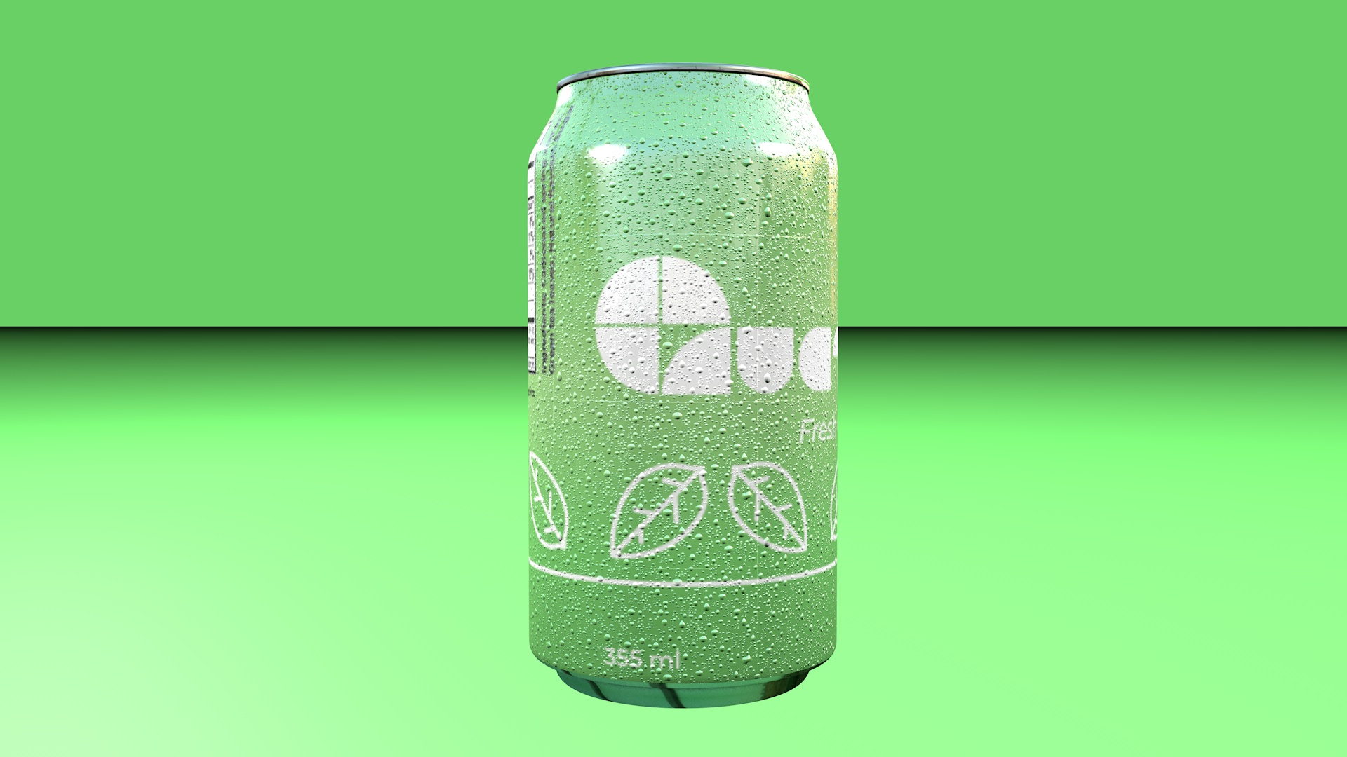
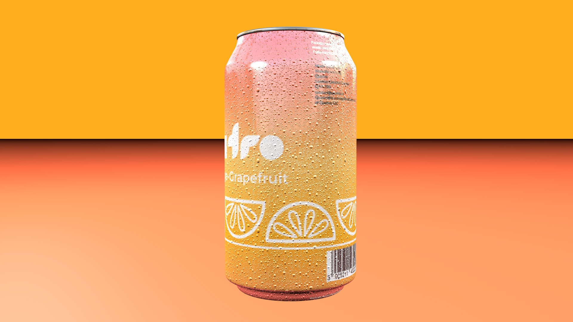
I settled on a smooth gradient for each one with the main colour being the flavours respective brand colour, and the secondary being colours that fit with the flavour names. Pink to white for Lychee Breeze; A light green to green colour shift for Fresh Green Tea; Yellow to a light green for Lemon-Lime Twist; Orange to red for Bold Orange-Grapefruit.
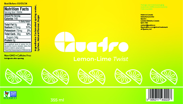
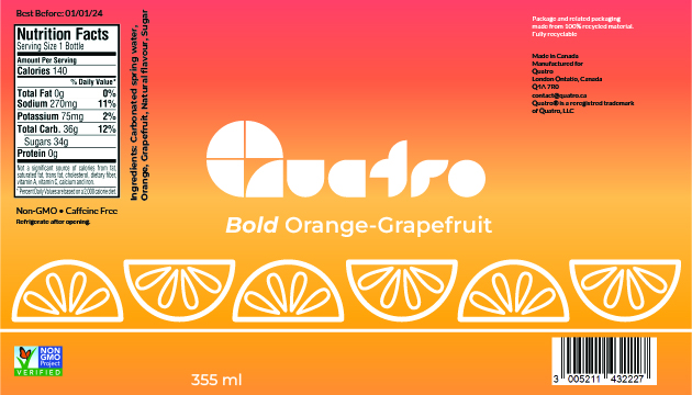
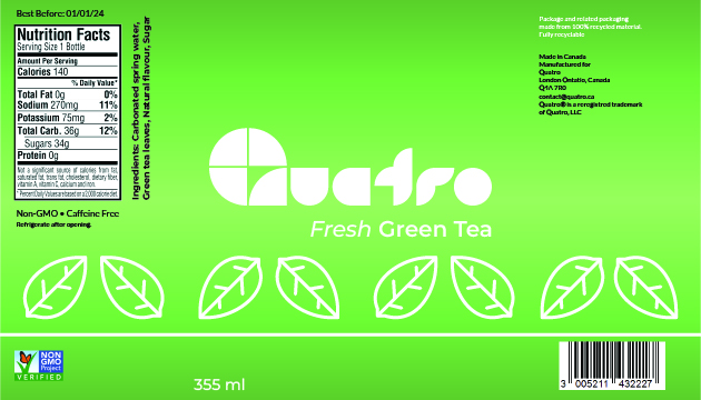
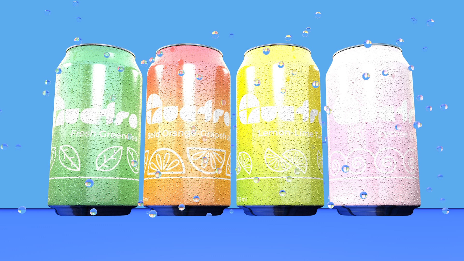
Finally, I tidied up the layout and the labels were ready for mockups. This was one of my favourite projects I've worked on. It was extremely gratifying to have full creative agency and to be able to make something unique.
Like what you see? Want to see more? Let's work together! Use the contact form to reach out, and I will get back to you ASAP!